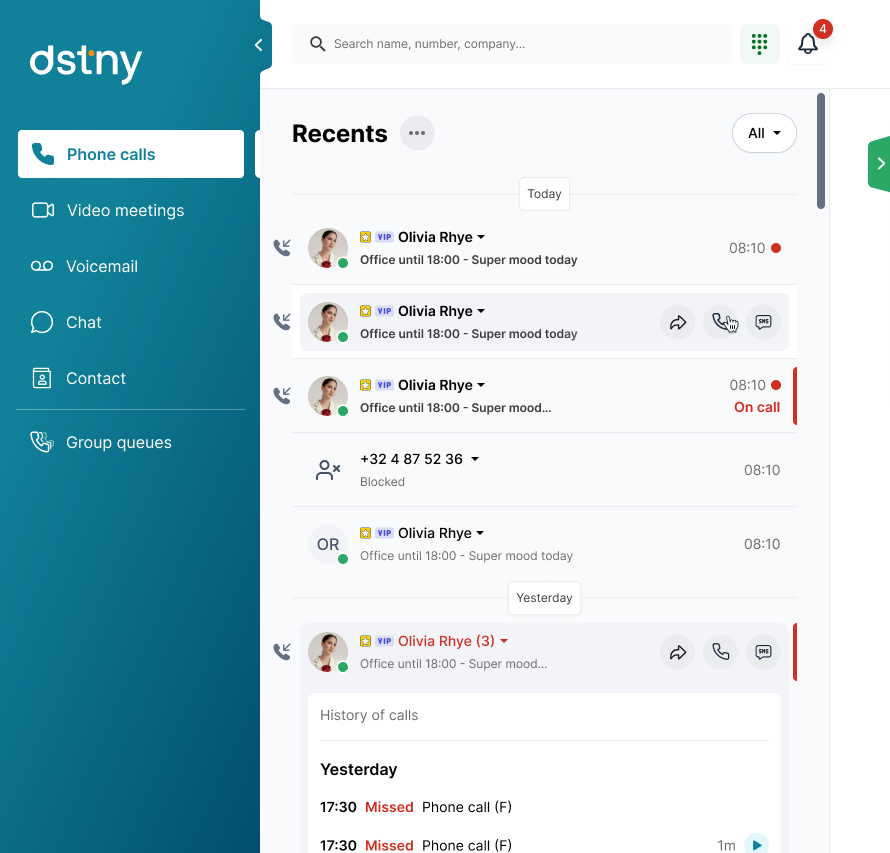
DSTNY
A revamp for a leader in secure cloud communications
DSTNY
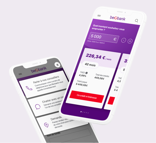
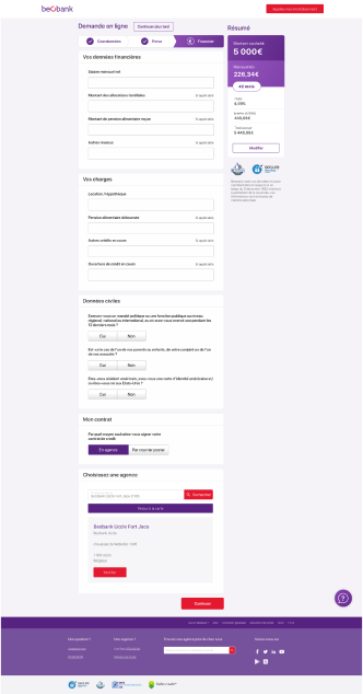
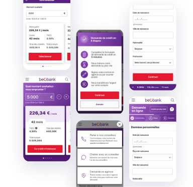
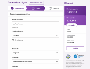
Beobank wanted to increase the conversion rate of its online loan simulator. The Belgian bank also wanted to take the opportunity to completely redesign the mobile and web version of its interface in order to offer the best possible experience.
Double the conversion of the Comfort Plus loan, by completely rethinking the conversion funnel on the simulator.
Why repeat what has already been done? During our first preparatory sprint, we:
An essential step in order to select the methodologies to be implemented during our user experience study.
Our conclusions of this analysis phase? The conversion funnel was too long, prospects needed human contact and had to be reassured about security of safety. The loan simulator was considered unengaging.
“Our benchmark of the competition is one of the elements that most marked the managers of Beobank”, says Raphaël Verheyden, Head of Design Operations. “We presented them with an in-depth competitive analysis, which led to the emergence of a series of good and bad ideas, based on our expertise.”
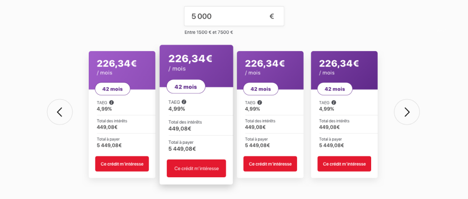
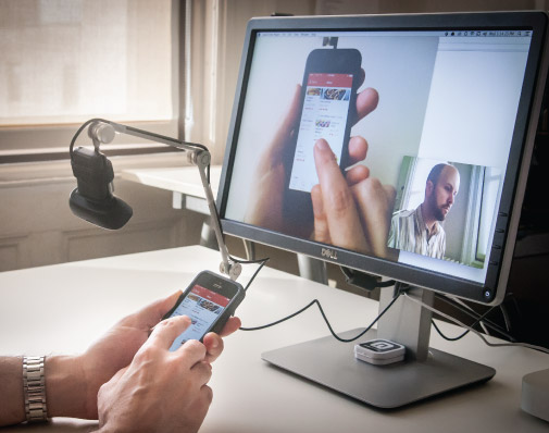
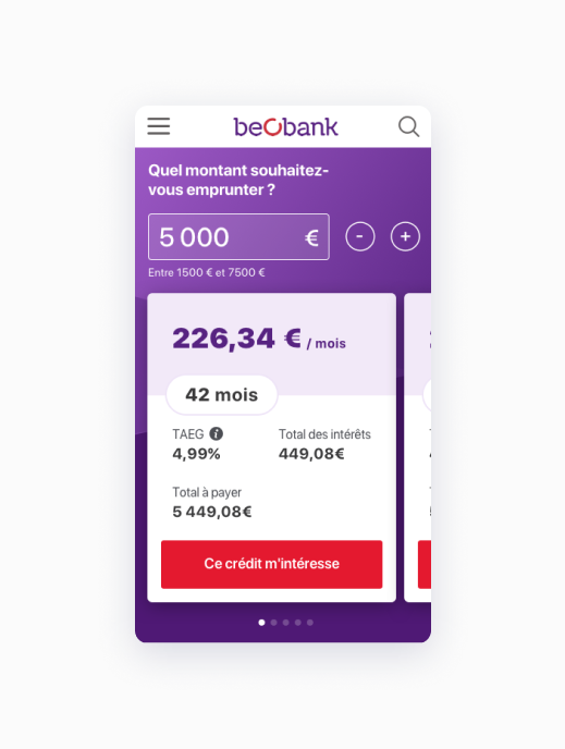
Our credit simulation prototype was tested by ten people, half of whom had never before borrowed money from a bank. Every word, every color and every design element was evaluated, in order to validate the performance of the digital interface.
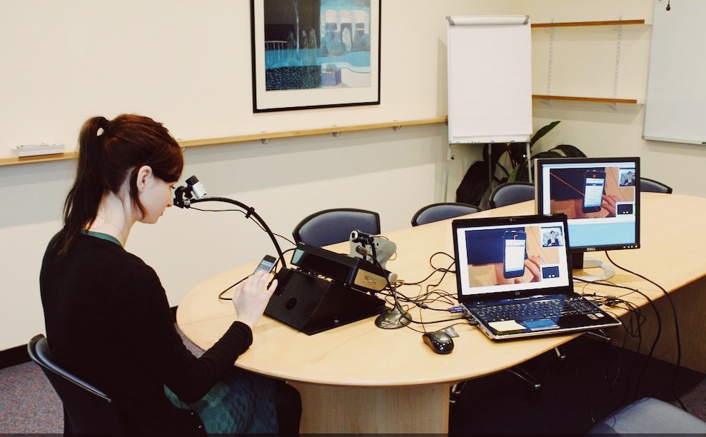
Eye-trackers make it possible to follow the user’s gaze and attachment points on the smartphone screen. A technique that objectively confirms or refutes the behaviour detected during the test.
In the case of our test, the eye-tracker established that users correctly see the important elements, namely the amount of the monthly payment, the duration, the total to be paid and the rate.
When Beobank announced to its users that they will be able to sign their contract remotely, half of them expected to be able to sign their contract digitally. But in practice, this was not the case.
A later change to the text specified postal mailing. This precision avoided frustration on the part of those that imagined being able to use their card reader or having to send their contract by email.
In the Think Aloud observation method, users have to think out loud as they perform a task. What are they watching? What do they think? What do they do and how do they feel at every moment?
This is a particularly useful approach that reveals user expectations and identifies confusing aspects of a system.
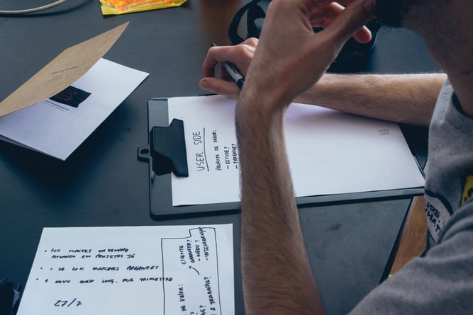
Any nice idea is worth trying! A Design Studio workshop brought all Beobank stakeholders around the table.
Our objective? To ask them to outline the 3 pages of the online credit simulator. To do this, we assisted them with tools and methods from Design Thinking. This exercise allowed us to listen and challenge each idea.
“This principle of co-creation energizes the process, makes it possible to unravel a whole series of problems or tensions and, ultimately, minimizes the risk that the customer does not adhere to our final conclusions,” explains Raphaël Verheyden. “It’s an alignment that saves time during the design phase of the web interface.”
DSTNY
VOObusiness
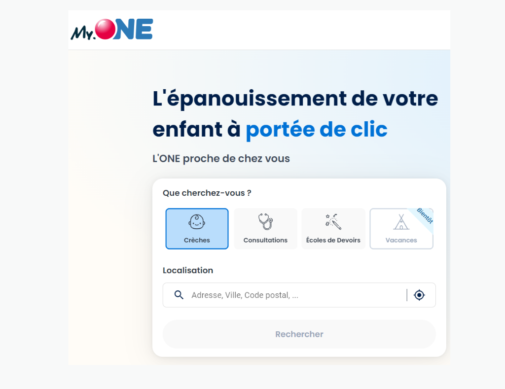
MY.ONE
ConnectMe
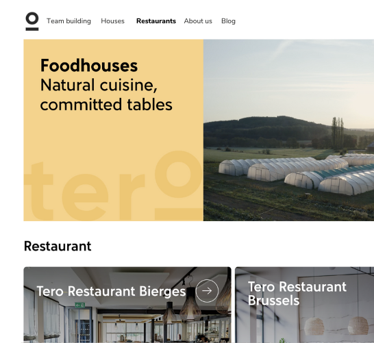
Tero
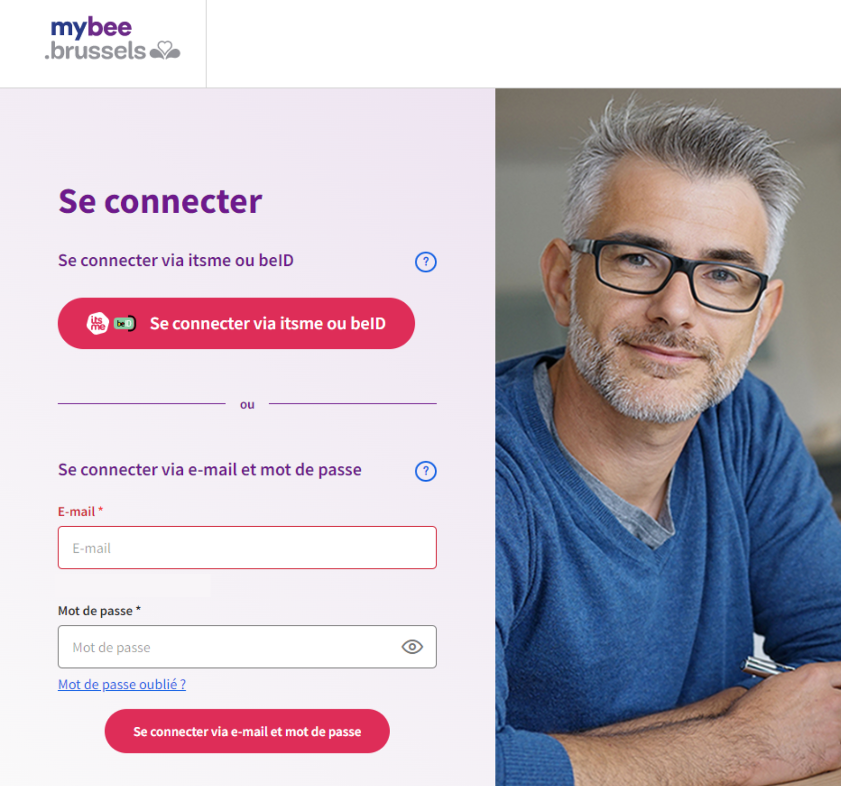
myBee
Solvay
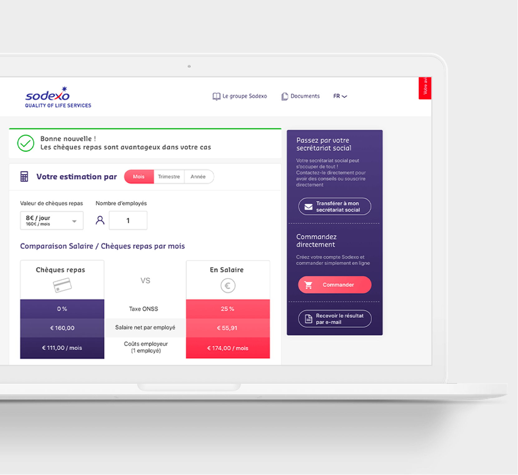
Sodexo